Every scrum master has created a Burn Down chart by hand at some point in their career. If you haven’t, or hadn’t in a while I highly recommend you do just to re-acquaint yourself with not only how you do it but, why you are doing it. What I have often found in working with peers who are using automated tools is that it has become a ceremonious act with only one purpose. The manager wants it so, you create it. If this is why you are creating charts then it’s time to hit the reset button on that way of thinking.
I like pictures, images, or charts that move me from a resting state of mind to an actionable, transformative state of being. There’s a tacit understanding that takes place when data strikes a chord in you. So, why create a Burn Down chart that does nothing other than to serve the purpose of being another ‘information only’ chart in a Power Point presentation? Let’s create something that rallies the troops!
There are metrics you can add to a Burn Down chart that are great for starting a conversation with your product/program manager about your team. or team of teams. By the end of this article, you will see that it’s not how much you burn it’s the quality of the burn. You will also be able to answer the question, “What is holding us back from delivering more?”, in a chart that everyone is familiar with.
Now, I know that most of you are seasoned professionals and some of you might be tuning out right about now. Heck, you can speak from your gut about what is holding your team back why isn’t it obvious to everyone else? In part, you are right and that’s a good starting point. But the reality is that working from instinct only is not compelling enough without data. With these suggested enhancements to a simple Burn Down chart you can not only show what is happening and why impacts overall team productivity, you can discuss the issues with management and take action. It may well be all you needed to get the support you need to overcome what I refer to as a ‘productivity plateau’. Teams committed to agile best practices will agree with the following:
Every team member that is not constantly reassessing and learning how to increase productivity is on a plateau and doesn’t know it.
Shining a light on that plateau is often enlightening and empowering to a team and it’s members.
First, let’s look at a standard Burn Down chart:
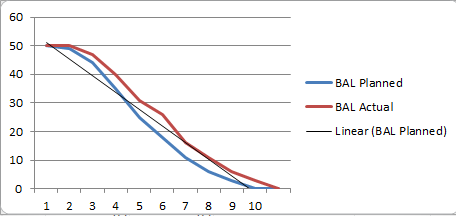
For the sake of this discussion we will use the same data. Here we see story points on the left vertical axis and time on the horizontal axis.
We can see that this team rarely hit its planned cadence. From looking at this can you tell what happened?
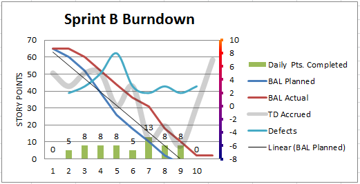
Now let’s add a some thinking to the chart.
1). Technical debt is nothing new. In a Burn Down chart however, it can give us insight into the ebb and flow of the debt and helps explain why we are not as productive as we could be. The list of done vs. undone work that leads to technical debt can be quite extensive. Here are some typical ones:
- Requirements / Data Analysis
- Design
- Dependency Analysis
- Refactoring
- Stability testing
- Performance testing
- Integration and implementation coordination with the work of other teams
- Release notes
- Regression testing
- Code reviews
If any of the above are left undone then you can expect a good amount of technical debt to carry over plus a high likeliness for defects to pop up in your next sprint. The definition of done is all about completeness with quality. This is something I learned on working for my father’s construction company. If my dad came on a job site and saw work that wasn’t completed with high quality he would have the crew do it again, He would then tell the crew that if they did a sloppy, low quality but quick job it would require more time and money to do it over again than if they had taken the time to do it right the first time. A worker on one job once said to him that he couldn’t guarantee he could deliver that all the time since he was new to the work. My dad pulled him aside and told him, “It’s not that you can’t do it right, it’s that you don’t know how to do it right. So, I’m going to show you how.”. Then, my dad would proceed to show him and his crew how. If after being shown how to do it right these folks still did a sloppy job they were paired with someone as their mentor.
2. Defects. Also not new. Let’s see how many and when they are happening.
3. Daily points completed. Seeing this metric helps a team better understand and gauge their productivity especially when compared to the other charted variables.
Here’s what the above chart looks like with 3 new data sets:

Technical debt is the gray line that undulates throughout the project. It aligns with the right vertical axis. The ups and downs are a drag anchor on your productivity potential. The blue line is the defect count and also aligns with the right axis. The green bars along the bottom are the daily points completed. We can now see more clearly how technical debt and defects can tamp down productivity in terms of daily points completed. In essence, the team has ‘plateaued’. Every day the team spends churning on technical debt and defect management is another day of lost potential. The lesson is that you might hit the velocity you planned but is there a stretch goal you just can’t quite hit? Perhaps, it’s time to dig deeper.
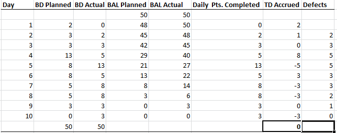
Here’s the data for all of the Burn Down Charts:
What about when you do not clean up all of your technical debt and defects in a sprint?
Here’s what that looks like:
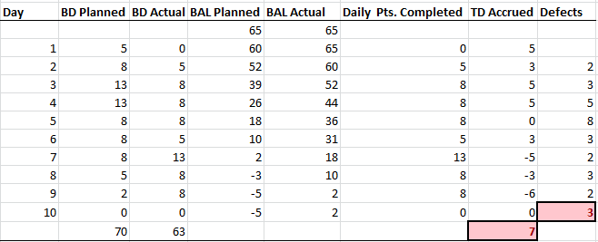
Now, we’ve got trouble brewing for the next sprint. Technical debt and defects are spilling over and the team is starting to get frustrated with the amount of work they have to accomplish. Sound familiar? How does your team address this? What do you proactively do to prevent or, mitigate this? In my next article I will show how we can enhance a Burn Up chart to help in catching issues early on!
Note: If you would like a copy of the chart in Excel to work with please write me – adjust the data to the way your team works and how your management measures teamwork.
